
利用 Python 绘制环形热力图
暑假伊始,Coldrain 参加了学校举办的数模集训,集训的过程中,遇到了需要展示 59 个特征与 15 个指标之间的相关性的情况,在常用的图表不大合适的情况下,学到了一些厉害的图表,但是似乎千篇一律都是用 R 语言、MATLAB 和 SPSS 绘制,Python 代码少之又少,遂作此篇,以为模板。
题目地址:
2012 年全国大学生数学建模竞赛 A 题
网络上找到的环形热力图 be like:
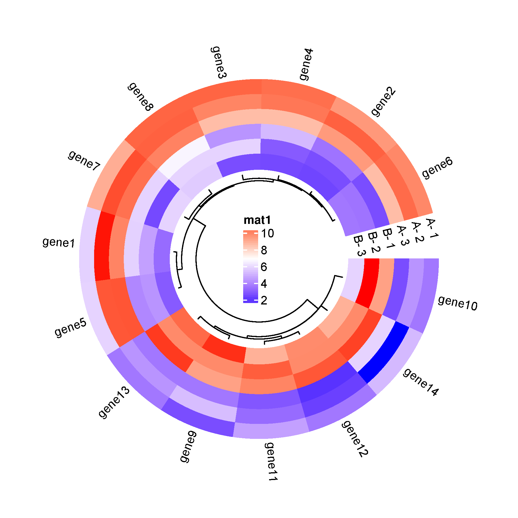
这种图片究竟是如何绘制出来的呢?
接下来,和小生用 Python 手搓一个吧喵 🐱
1. 嵌套饼图(Nested Pie Charts)
一开始,Coldrain 并无一点头绪,于是在 matplotlib 官网上提供的千奇百怪的图表样例里翻找,找到了一个叫做 Nested Pie Charts 的东西,翻译过来叫做嵌套饼图,官网给的嵌套饼图长这个样子:
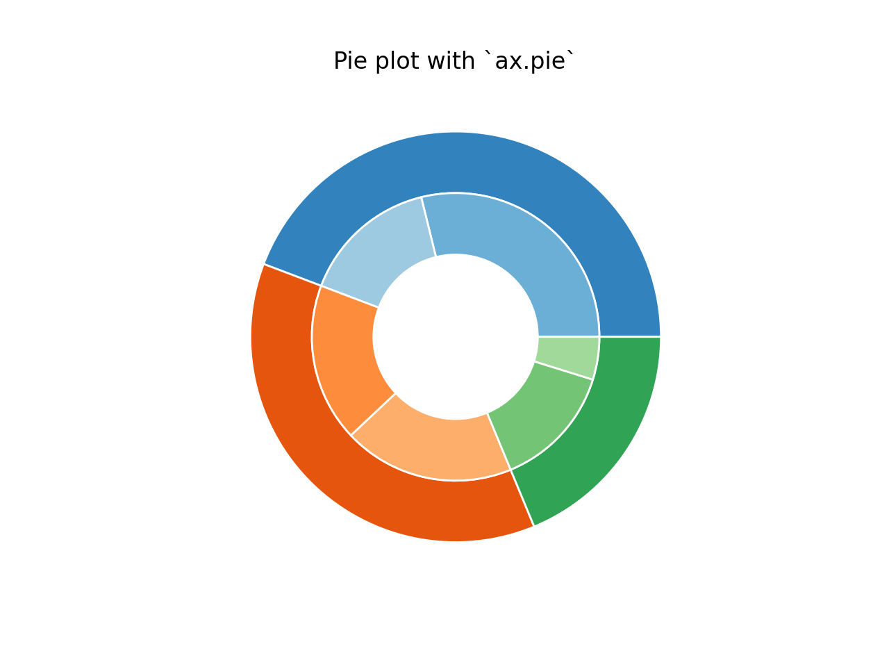
官网给出的第一份案例代码如下:
import numpy as np
import matplotlib.pyplot as plt

fig, ax = plt.subplots()

size = 0.3
vals = np.array([[60., 32.], [37., 40.], [29., 10.]])

tab20c = plt.color_sequences["tab20c"]
outer_colors = [tab20c[i] for i in [0, 4, 8]]
inner_colors = [tab20c[i] for i in [1, 2, 5, 6, 9, 10]]

ax.pie(vals.sum(axis=1), radius=1, colors=outer_colors,
       wedgeprops=dict(width=size, edgecolor='w'))

ax.pie(vals.flatten(), radius=1-size, colors=inner_colors,
       wedgeprops=dict(width=size, edgecolor='w'))

ax.set(aspect="equal", title='Pie plot with `ax.pie`')
plt.show()
但是!采用这种方法实现嵌套饼图的效率虽然很高,但是灵活性不高,不便于实现精细设计,于是官方又给出了下面这个新的实现代码:
import numpy as np
import matplotlib.pyplot as plt

fig, ax = plt.subplots(subplot_kw=dict(projection="polar"))

size = 0.3
vals = np.array([[60., 32.], [37., 40.], [29., 10.]])
# Normalize vals to 2 pi
valsnorm = vals/np.sum(vals)*2*np.pi
# Obtain the ordinates of the bar edges
valsleft = np.cumsum(np.append(0, valsnorm.flatten()[:-1])).reshape(vals.shape)

cmap = plt.colormaps["tab20c"]
outer_colors = cmap(np.arange(3)*4)
inner_colors = cmap([1, 2, 5, 6, 9, 10])

ax.bar(x=valsleft[:, 0],
       width=valsnorm.sum(axis=1), bottom=1-size, height=size,
       color=outer_colors, edgecolor='w', linewidth=1, align="edge")

ax.bar(x=valsleft.flatten(),
       width=valsnorm.flatten(), bottom=1-2*size, height=size,
       color=inner_colors, edgecolor='w', linewidth=1, align="edge")

ax.set(title="Pie plot with `ax.bar` and polar coordinates")
ax.set_axis_off()
plt.show()
现在,我们认真读一下上面的这段代码。
⚠️ Coldrain 觉得有必要认真读一下。
>> 1.1 创建极坐标图
fig, ax = plt.subplots(subplot_kw=dict(projection="polar"))
- 首先创建一个子图(
fig, ax),并指定为极坐标投影projection="polar"。 - 所有角度以弧度制表示,从 0 开始,逆时针增加。
>> 1.2 设置参数和数据
size = 0.3
vals = np.array([[60., 32.], [37., 40.], [29., 10.]])
size:每一个圆环的厚度(即扇形外圈半径长度减去内圈半径长度)vals:二维数组,每一行表示外圈的一个扇区,每行中两个数字表示该扇区内部的两个子分类(用于内圈)
❓ 看到这个
vals的形状和对应的饼图形状,你想到了什么?没错,似乎可以通过改变 vals 的维度来实现环形热力图的形状!
>> 1.3 角度归一化
valsnorm = vals / np.sum(vals) * 2 * np.pi
- 先将
vals所有数值加起来,然后把每个值按比例映射到 [0, $2\pi$] 的弧度范围(也就是一整圈的弧度) - 得到每个子块对应的角度宽度
>> 1.4 计算起始角度(边界)
valsleft = np.cumsum(np.append(0, valsnorm.flatten()[:-1])).reshape(vals.shape)
valsnorm.flatten()把二维数组拉成一维np.cumsum(...)计算角度的累积和,也就是每个条形的起始角度reshape(vals.shape)把它还原为原来二维结构
>> 1.5 设置颜色
cmap = plt.colormaps["tab20c"]
outer_colors = cmap(np.arange(3)*4)
inner_colors = cmap([1, 2, 5, 6, 9, 10])
- 使用
tab20c调色板。 outer_colors:每个外圈段使用不同颜色(间隔选择索引 0、4、8)。inner_colors:内圈颜色从调色板中挑选不同颜色索引。
🎨 关于
tab20c调色板:
tab20c是matplotlib中内置的分类调色板,共有 20 种颜色,包括 5 个颜色组(每组 4 个颜色)。其构成如下:
颜色组 索引范围 颜色说明 组 1 0-3 蓝绿色系(蓝、浅蓝、灰蓝等) 组 2 4-7 橙色系(橙、浅橙、灰橙等) 组 3 8-11 红紫色系(红、粉红、灰红等) 组 4 12-15 绿色系(绿、浅绿、灰绿等) 组 5 16-19 灰紫色系(紫灰、浅紫等)
>> 1.6 绘制外圈(大类)
ax.bar(x=valsleft[:, 0],
       width=valsnorm.sum(axis=1), bottom=1-size, height=size,
       color=outer_colors, edgecolor='w', linewidth=1, align="edge")
- 每个外圈段的起始角度为
valsleft[:, 0] width=valsnorm.sum(axis=1):每个大类的角度宽度是该行两个值之和。bottom=1-size:外圈从半径 0.7 开始(1-0.3=0.7)height=size:厚度是 0.3align="edge":从x角度开始绘制
>> 1.7 绘制内圈(子类)
ax.bar(x=valsleft.flatten(),
       width=valsnorm.flatten(), bottom=1-2*size, height=size,
       color=inner_colors, edgecolor='w', linewidth=1, align="edge")
- 每个内圈段的起始角度为展平后的
valsleft - 每段的角度宽度来自展平后的
valsnorm bottom=1-2*size:从半径 0.4 开始- 用不同颜色表示不同子类
>> 1.8 清理图像
ax.set(title="Pie plot with `ax.bar` and polar coordinates")
ax.set_axis_off()
- 设置标题
- 去掉极坐标轴的刻度、边框等
2. 着手绘制环形热力图
由于数据采用的是小生本地的数据,所以这部分代码应该只能用作学习、讲解,如果你想要开袋即食的函数,可以根据下面的代码进行调整(
具体讲解咱们以注释的形式写在代码块里喵:
'''
Part1 导入库
'''
import numpy as np
import matplotlib.pyplot as plt
from matplotlib.cm import get_cmap, ScalarMappable
import pandas as pd
from matplotlib.colors import Normalize, mcolors # 用于标准化颜色映射和自定义 colormap
from mpl_toolkits.axes_grid1.inset_locator import inset_axes   # 在极坐标图中嵌入色条
import matplotlib.font_manager as fm      # 支持中文字体加载


'''
Part2 读取数据
这里小生用的是自己的数据,如果需要参考的话,请务必替
换成自己的数据
(其实这部分不需要关注,直接跳转到 Part3 即可)
'''
red_results = pd.read_excel('red_results.xlsx')
df_doc2_1 = pd.read_excel('doc2.xls')
unprocessed_categories = df_doc2_1.columns.tolist()
categories = [item for item in unprocessed_categories if 'Unnamed' not in item][1:]
color = categories.pop(-1)
for i in ['L', 'a', 'b', 'H', 'c']:
    categories.append(color+i)

df_doc2_2 = pd.read_excel('doc2.xls', sheet_name='葡萄酒')

unprocessed_categories = df_doc2_2.columns.tolist()
categories_red = [item for item in unprocessed_categories if 'Unnamed' not in item][1:]
color = categories_red.pop(-1)
for i in ['L', 'a', 'b', 'H', 'c']:
    categories_red.append(color+i)

categories_white = deepcopy(categories_red[1:])

unprocessed_grape_features = red_results.iloc[:,0].to_list()
grape_features = []
for i in unprocessed_grape_features:
    if i not in grape_features:
        grape_features.append(i)

unprocessed_wine_features = red_results.iloc[:,1].to_list()
wine_features = []
for i in unprocessed_wine_features:
    if i not in wine_features:
        wine_features.append(i)


'''
Part3 将相关系数填入 59*15 大小的列表中
(这里只需要生成你自己的数据即可)
'''
feature_value_map = [[0.0 for i in range(59)] for j in range(15)]

for i in range(145):
    line = red_results.iloc[i,:].to_list()
    # print(line)
    n_col = categories.index(line[0])
    n_row = categories_red.index(line[1])
    # print(n_row, n_col)
    feature_value_map[n_row][n_col] = line[2]


'''
Part4 图片绘制
'''
def truncate_colormap(cmap, minval=0.2, maxval=0.8, n=256):
    """
    这个函数用来实现 cmap 的截取,具体 cmap 操作可参考
    matplotlib 官网
    """
    new_cmap = mcolors.LinearSegmentedColormap.from_list(
        f'trunc({cmap.name}, {minval:.2f}, {maxval:.2f})',
        cmap(np.linspace(minval, maxval, n))
    )
    return new_cmap

# 手动添加中文字体(请根据实际路径更改)
font_path = '/usr/share/fonts/noto-cjk/NotoSansCJK-Medium.ttc'
my_font = fm.FontProperties(fname=font_path)

# 参数设置
num_rings = 15       # 行数(饼图圈数)
num_segments = 59    # 列数(每圈有多少小格)
ring_width = 0.5 / num_rings  # 控制总半径范围在 [0.5, 1]
angle_width = (1.75 * np.pi) / num_segments      # 这里如果调成 2*np.pi 的话是一个完整的圆
angles = np.linspace(0.5 * np.pi, 2.25 * np.pi, num_segments, endpoint=False)       # 设置起始角度和结束角度

# 采用蓝-白-红渐变的配色(请根据个人喜好自行调整)
cmap = get_cmap("RdBu").reversed()      # 这里对 cmap 进行取反操作
cmap = truncate_colormap(cmap, minval=0.1, maxval=0.9)
norm = Normalize(vmin=-1, vmax=1)

# 创建画布
fig, ax = plt.subplots(figsize=(10, 10), subplot_kw=dict(polar=True))
ax.set_axis_off()    # 将坐标轴隐藏
ax.set_title("酿酒红葡萄理化指标与红葡萄酒理化指标之间的关系热力图", fontsize=14, fontproperties=my_font)       # 设置标题

# 绘制所有圈(从外向内)
for i in range(num_rings):
    bottom = 0.8 - (i + 1) * ring_width   # 每一圈的起始位置
    height = ring_width

    for j in range(num_segments):
        color = cmap((feature_value_map[i][j] + 1)/2)   # 颜色映射
        theta = angles[j]   # 当前段(单元格)中心角度
        radius = bottom + height / 2      # 填入数值的位置(方格上界和下界中间的位置)

        # 对每个单元格执行操作
        ax.bar(
            x=angles[j],    # 中心角度
            width=angle_width,     # 扇形的角度宽度
            bottom=bottom,  # 环的底部半径
            height=height,  # 环的厚度
            color=color,    # 采用的颜色
            edgecolor="black",     # 设置分割线颜色
            linewidth=0.3,  # 设置分割线宽度
            align="edge"    # 对齐方式(从角度边缘开始)
        )
        if np.abs(feature_value_map[i][j]) > 0:
            ax.text(
                theta + angle_width / 2,  # 移到扇形中间
                radius,
                f"{feature_value_map[i][j]:.2f}",            # 保留两位小数
                ha='center', va='center',   # 水平/垂直居中(horizontal/verticle)
                fontsize=4.5,
                color='black' if abs(feature_value_map[i][j]) < 0.7 else 'white',  # 自适应颜色
                rotation=0  # 不旋转文本
            )

# 在最外圈插入指标名称
label_radius = (0.3 + num_rings * ring_width + 0.02)  # 最外圈外一点点
indicator_labels = [f'HG{i}' for i in range(1, num_segments + 1)]
for j in range(num_segments):
    theta = angles[j] + angle_width / 2  # 扇形中间角度
    label = indicator_labels[j]

    ax.text(
        theta,
        label_radius,
        label,
        fontsize=8,
        ha='center',
        va='center',
        rotation=np.degrees(theta - np.pi / 2),
        rotation_mode='anchor'
    )

# 在圆环缺口处添加文字
theta_gap = np.deg2rad(90)  # 可调
ring_width = 0.5 / num_rings
for i in range(num_rings):
    radius = 0.3 + i * ring_width + ring_width / 2
    ax.text(
        theta_gap,
        radius,
        f"  HW{15-i}",              # 或者你自定义的 label[i]
        fontsize=6.5,
        ha='left',               # 靠左对齐,文字朝外
        va='center',
        rotation=0,
        rotation_mode='anchor',
        color='black'
    )

# 在极坐标图的中间嵌入一个小长条色带(纵向)
cbar_ax = inset_axes(ax,
    width="4%",   # 相对于父图宽度
    height="25%",  # 相对于父图高度
    loc='center'   # 放在图中心
)

sm = ScalarMappable(cmap=cmap, norm=norm)
sm.set_array([])
cbar = plt.colorbar(sm, cax=cbar_ax, orientation='vertical')
cbar.set_label("相关系数 R", fontsize=10, fontproperties=my_font)

# 保存图片
plt.tight_layout()
# plt.show()
plt.savefig("my_figure2.png", dpi=300, bbox_inches='tight')
运行之后,得到的效果图如下所示:
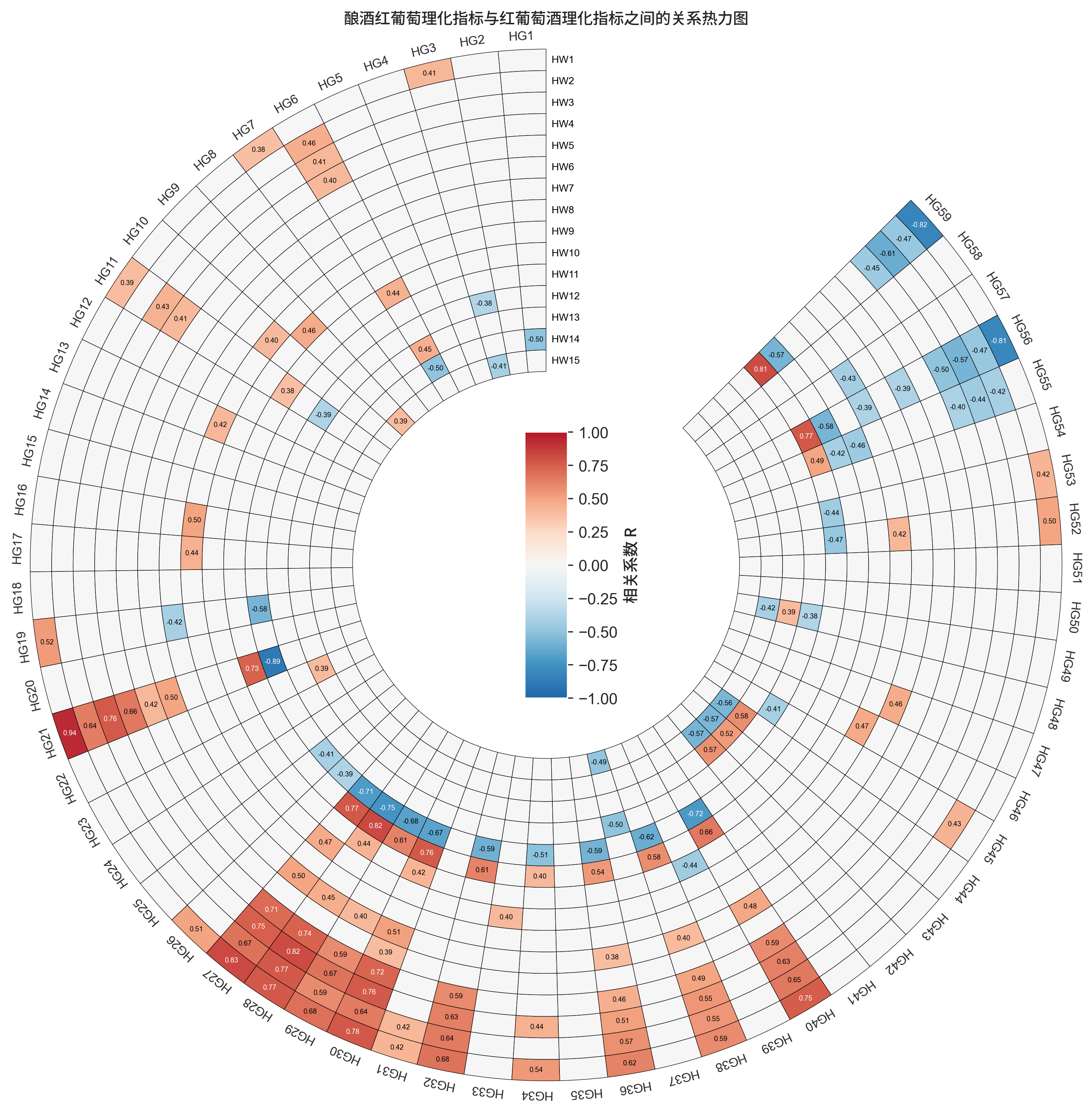
效果图的配色等设计可能有欠缺的地方,但由于时间紧迫,并没有太多时间用于色彩、样式设计…
3. 参考
[1] matplotlib 官网嵌套饼图教学(Nested pie charts)